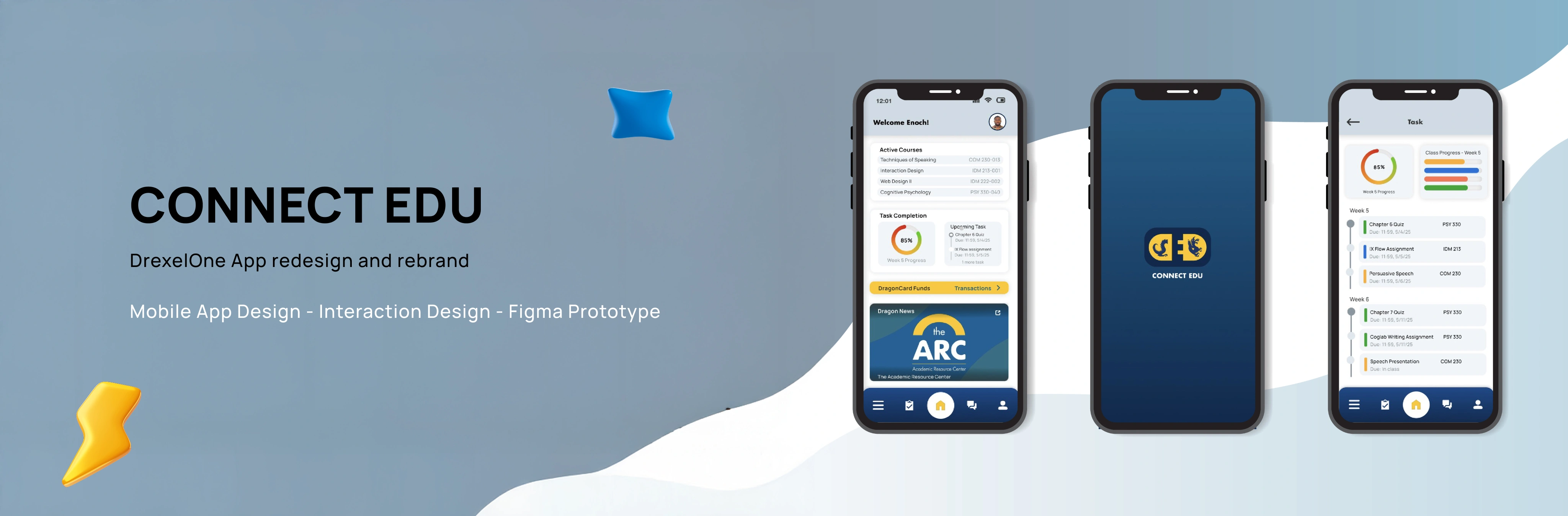
Connect Edu
Overview
Connect Edu is a conceptual platform design based on Drexel's DrexelOne App. It is a mobile app designed for Drexel University students providing convenient access to personal academic, financial, and campus information. The Connect Edu project aims to create an interactive and intuitive user experience that addresses common pain points in the DrexelOne platform, including the need for fewer taps to find information and a lack of assignment and task reminders, which can lead to poor academic progress overall. This was achieved by adding engaging microinteractions and visually appealing interfaces throughout the app experience.
Timeline
March 2025 - June 2025
Role
Solo Designer
Tools
Figma, Jitter
Problem
DrexelOne App faced several challenges;
-
Outdated Interface: The existing platform was outdated both visually and functionally. Its clunky interface and poor responsiveness made it difficult to navigate daily tasks efficiently.
-
Unreliable real-time information: Notifications for messages and announcements are often delayed or fail to appear altogether, and there are no alerts for assignment updates.
-
Too many taps to find information: The user goes through too many steps just to complete basic tasks, which makes the experience slow and frustrating.
Goals
Some of the goals for the Connect Edu project Include;
1
Rebranding
A Complete rebrand and a new look on the visual design.
2
Redesign user flow
Introduce quick-access shortcuts to allow task completion in a few taps.
3
UI and microinteractons
Design clean, student-friendly UI and microinteractions that feels intuitive and easy to navigate.
4
User satisfaction
Add additional pages that enables students to track academics.
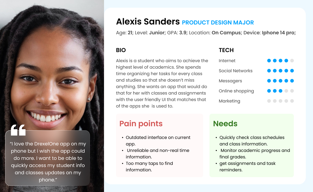
User Persona
Design Process
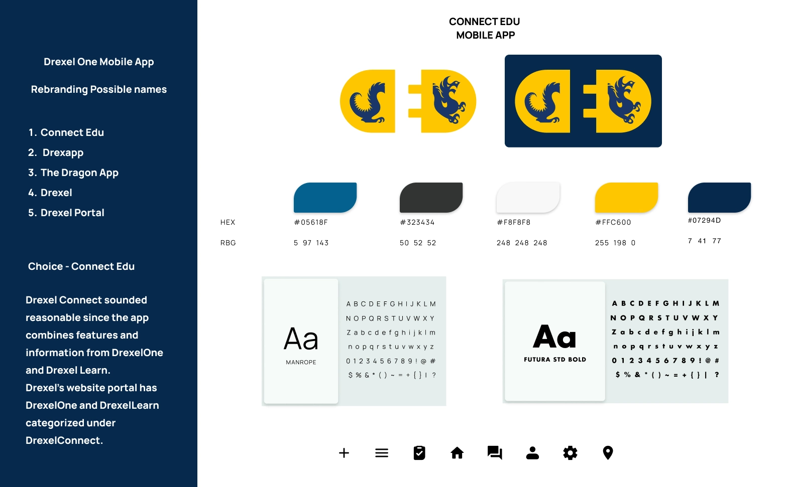
Brand Identity
I rebranded the app completely by changing the name and designing a minimalist and modern logo that best fit the name and purpose of the app. I also added additional colors to the color palette to give it more color range. For Typography, i decided on using Manrope for the body text and Futura STD Bold for headers and titles. I also added rounded filled in iconography to keep it clean.
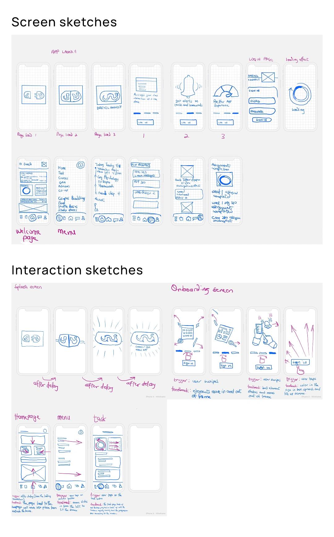
Screen Sketches
Using insights and research from the old app’s task flow and target audience, I sketch out early screen designs to explore layouts, interactions, and microinteraction ideas through rapid iteration before moving into wireframes.
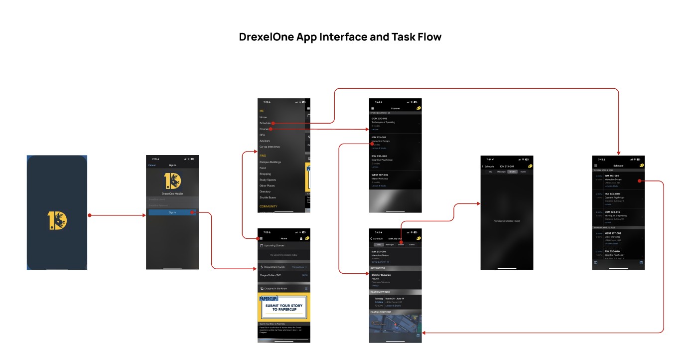
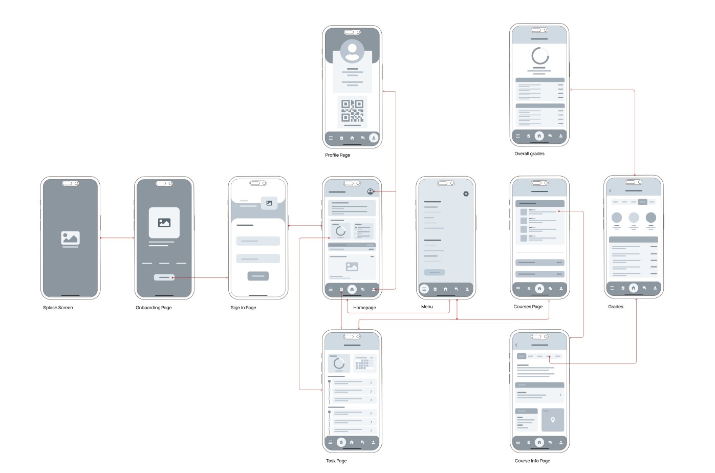
Wireframes and Wireflow
After finishing the sketches, I landed on an idea structure of how i wanted the screens and interactions to be. Using that, i designed the wireframes and wireflow to show the layout of the design solutions and how information is arranged on each page with focus on usability.
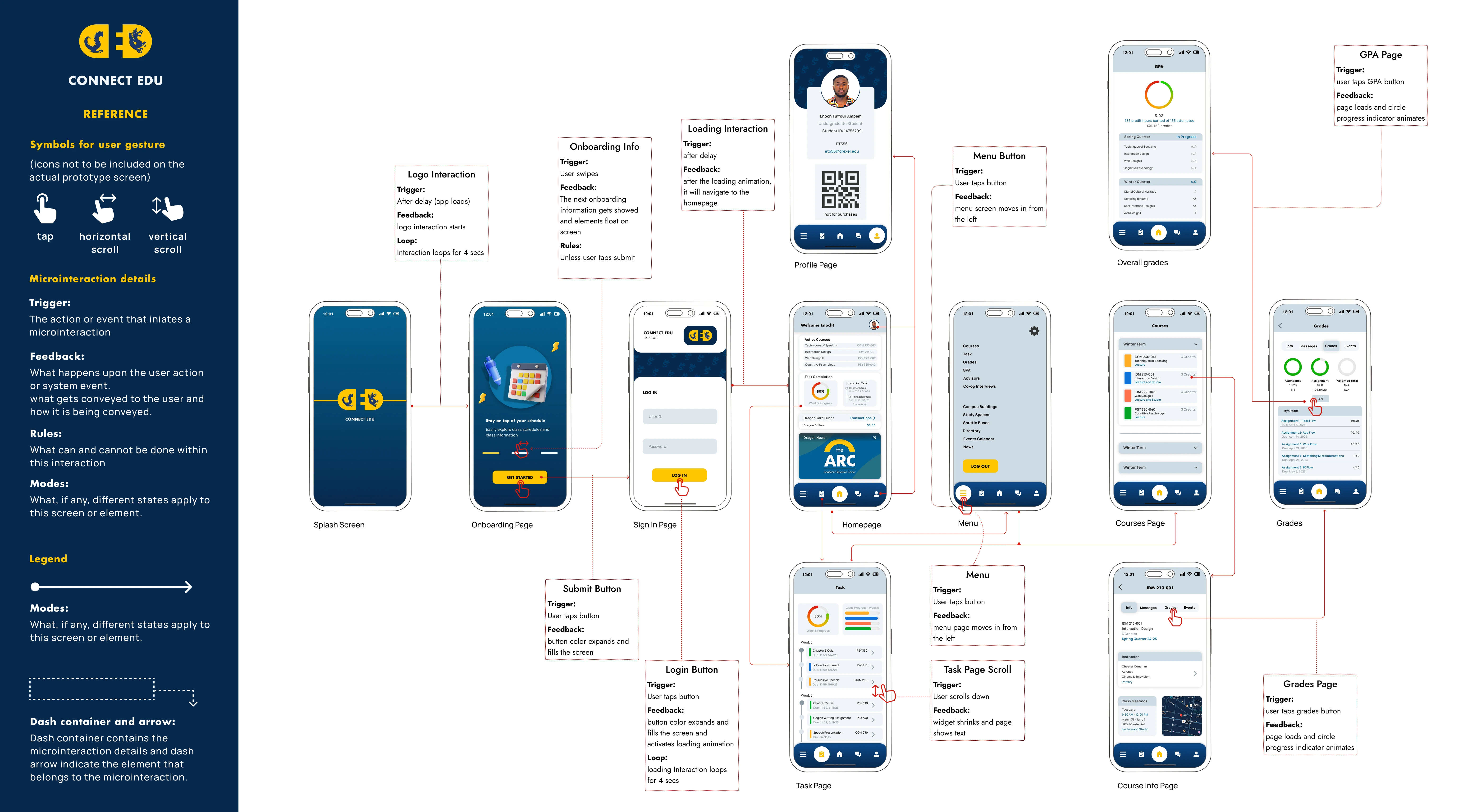
High-Fidelity Designs and IX Flow
This is where the screens were polished with the finalized design solutions including the refined color palette, typography, and responsive grid that improves usability. This also includes documentation of the Interaction Flow showing the triggers, feedback, and rules for all interactions.
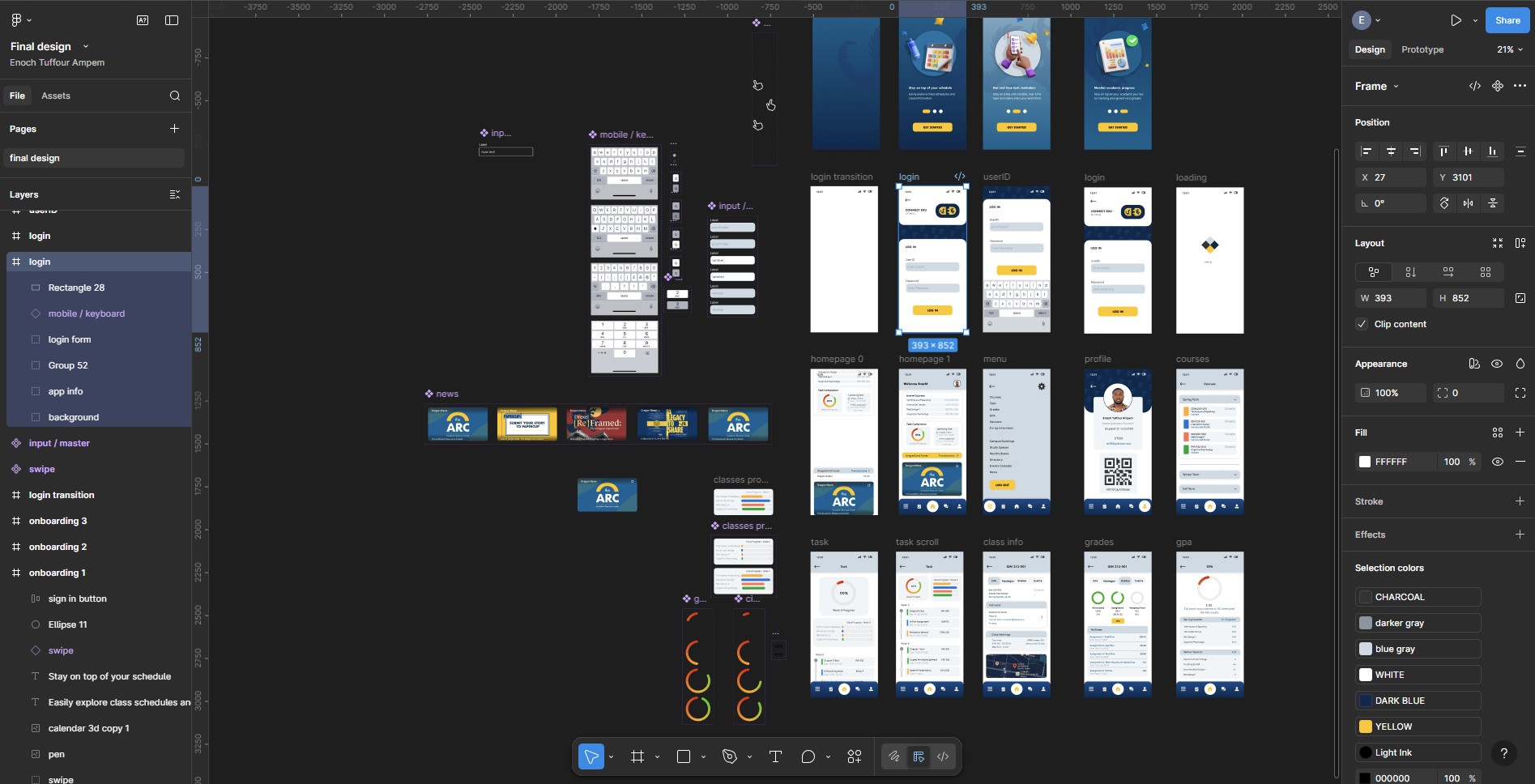
Animations and Interactions
To bring Connect Edu to life and improve the overall user experience, I focused on designing subtle animations and interactive elements that guide users through the platform intuitively. This was made possible using the ideas from the sketches and the interaction guide from IX flow. Majority of the interactions were made with figma and the splash screen animation was made with Jitter.
Results
The final interaction design delivered a clean and intuitive experience, with users easily navigating through the task. Micro-interactions and animations improved feedback and engagement, while consistent visual cues reduced confusion with was common in the old app.
Breakdown of final product
Onboarding
By using subtle animation, the splash screen design sets a clear first impression of Connect Edu’s refreshed identity. The onboarding screen also introduces the user to key improvements with messaging, supportive visuals, and interactions.
Login
The Login page includes an interactive text Input with keyboard to enhance usability with the prototype.
Class info and grades task flow
This shows the interaction on each page while completing the task of checking grades or finding class information. There is also interaction on the menu page, task page, and profile page.
You can explore the full interactive prototype here
Reflection
Designing Connect Edu reinforced the importance of intentional interactions and clarity in user flows. By iterating through sketches, wireframes, and interactive prototypes, I learned how small design decisions especially micro-interactions can significantly improve usability and user confidence. This project strengthened my ability to translate user needs into thoughtful, polished interaction design solutions.


